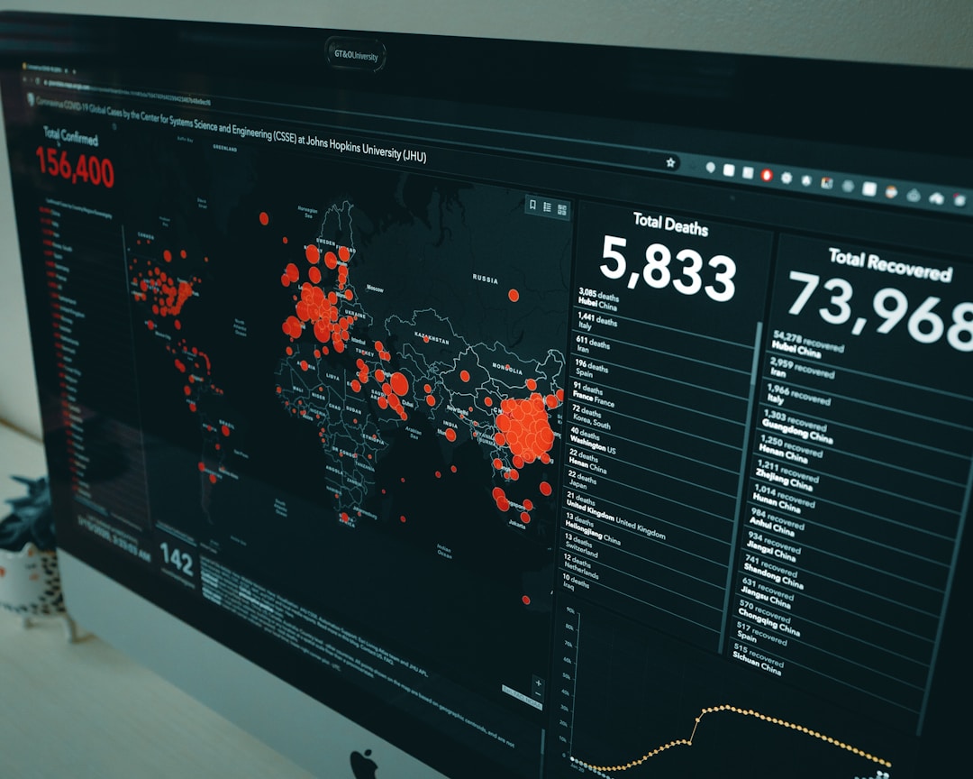
In the world of Big Data, data visualization has become one of the best practices to understand information. Data visualization provides a graphical representation of data via charts, graphs, and maps to make trends, outliers, and data patterns easier to understand. Such tools are vital to analyzing large amounts of data and using them to make data-driven decisions.
What Are Data Visualization Tools?

Data visualization software takes information and puts it into a visual format for data analysis. Visualization software makes it easier to understand the insights found within large amounts of data. Some of the most common visual representations include graphs, charts, and heat maps. The right software gleans through data sets and turns raw data into an interpretable format to present the most relevant data. Depending on the complexity of the software, it can either be easy to use or complex and require technical and data science skills.
There are several types of visual methods you can use to effectively present data. The most common visual methods include charts, tables, graphs, maps, infographics, and dashboards. More specific methods include area and bar charts, box-and-whisker plots, bubble clouds, bullet graphs, cartograms, circle views, dot distribution maps, heat maps, histograms, matrices, scatter plots, timelines, or any mix-and-match combination in a dashboard.
Why Use Data Visualization Tools

Leveraging the right visualization tools puts the power of data analytics in your hands. Every business function within an organization generates large data sets that need to be interpreted and acted on. Making data more meaningful results in better business insights and more data-driven business decisions that increase efficiency.
Configure One is a leader in data visualization software. Their product visualization software offers an impressive way to bring products to life according to specific configurations. Configure One visualization software features interactive, real-time 3D CPQ visualization capabilities that support photorealistic models and animations. Real-time 2D visualization capabilities allow customers to interact with a rendering of the product and understand exactly how the final product will look and function.
Leveraging a visual configurator is the best way to deliver a specific configuration, detect performance issues, ensure order accuracy, and streamline the order process. Best of all, product visualization software saves both you and your customer time and money creating the desired configured product. The more money customers save with your business, the more you will see customer loyalty and customer satisfaction increase.
The Benefits of Visualization

There are several benefits to this type of analytics solution. The human eye is naturally drawn to colors and patterns. Putting data in a visual format makes it easier to understand information, convey the right message, and keep viewers interested. It’s far easier to spot trends and outliers when data tells a visual story. Big data is here to stay, and the key to staying competitive in any industry is leveraging the power of data. By curating data into an easy-to-digest format, you can highlight trends and outliers while removing excess noise and unnecessary information. Effective visual tools combine form and function to tell the right story and capture attention.
Taking a visual approach to data is important for all industries. This is especially true for science, technology, engineering, and math (STEM) fields as well as government, finance, service, and consumer goods industries. Putting data in a visual format makes viewers pay closer attention to details while attractive images invoke a stronger emotional response to what’s being presented. Visual data representations are more shareable than large data sets, and they make it easier to compare multiple trends. Looking at visible trends and patterns allows for faster predictions and helps users decide which emerging trends to embrace.


